PROJECT OVERVIEW
The Yuka App scans food, beauty & personal care products to decipher their ingredients and determines the impacts on a user's health. For this project, I conducted user research, developed and prototyped a modernized, updated version of the app with improvements for a cohesive user experience.
TIMELINE
Late March - Early May 2025
TOOLS
Figma, Adobe Illustrator, Adobe Photoshop
PROBLEM
There is no centralized source that contains accurate information regarding ingredients in everyday products that helps users make educated decisions.
RESEARCH
How can apps like Yuka optimize their camera and AI technology to make the everyday shopping process more mindful and beneficial for the average consumer?
HYPOTHESIS
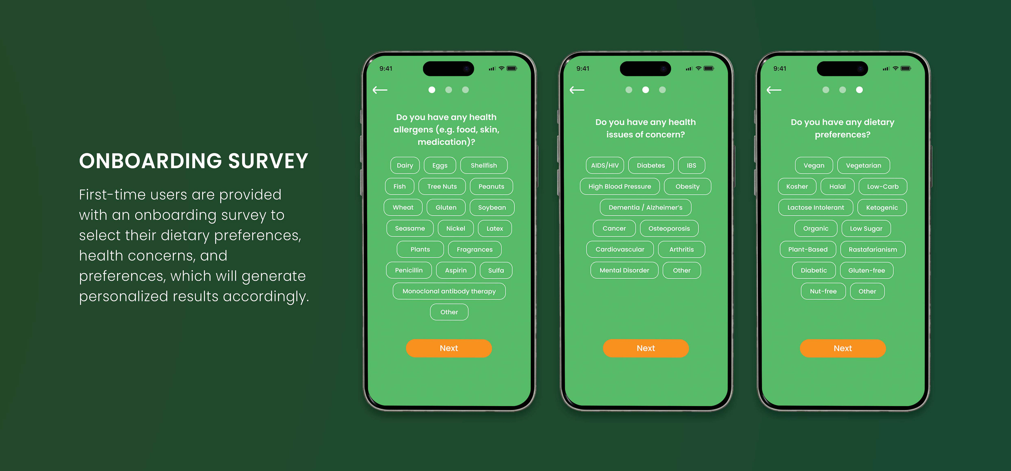
By developing an efficient onboarding system and enhancing the rating system with advanced camera and AI features to deliver accurate product information, it can increase user confidence in purchasing everyday products that meet their needs.
PROPOSAL
Applications such as Yuka, Think Dirty, and EWG function as innovators in promoting consumer awareness of healthier product alternatives. However, these platforms tend to leverage marketing strategies that stigmatize standard products as "unhealthy," thereby disproportionately favoring larger corporations. Many of these healthier alternatives are often priced at a premium, imposing financial barriers on cost-conscious consumers. Additionally, some platforms implement annual listing fees, potentially disadvantaging smaller businesses lacking sufficient financial resources. While Yuka does not require listing fees, its rating system tends to highlight products with numerous ingredients as high-risk, which may limit the platform's effectiveness in providing comprehensive consumer education about the purpose and safety of various chemicals in products.
Thus, this research aims to find a solution to optimizing the user-experience of product scanning apps through personalization, seamless navigation and a reliable rating system, thereby instilling confidence in consumers' shopping decisions.
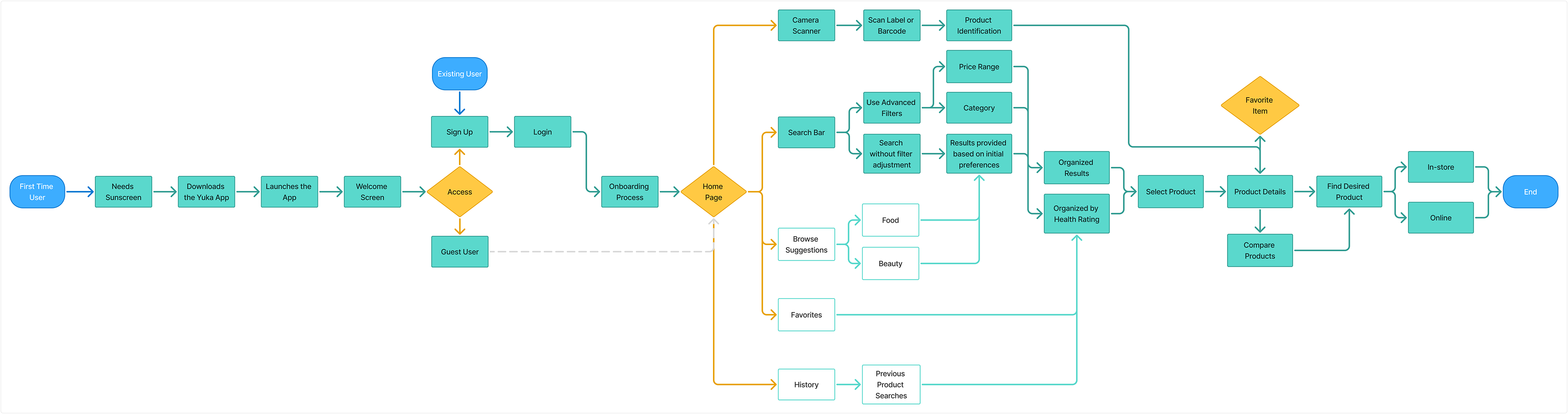
Overview of User Flowchart
Primary Task: Users find healthy and budget-friendly product alternatives that align with their needs.
This helps me visualize and understand how each user navigates the app for it's intended purpose.
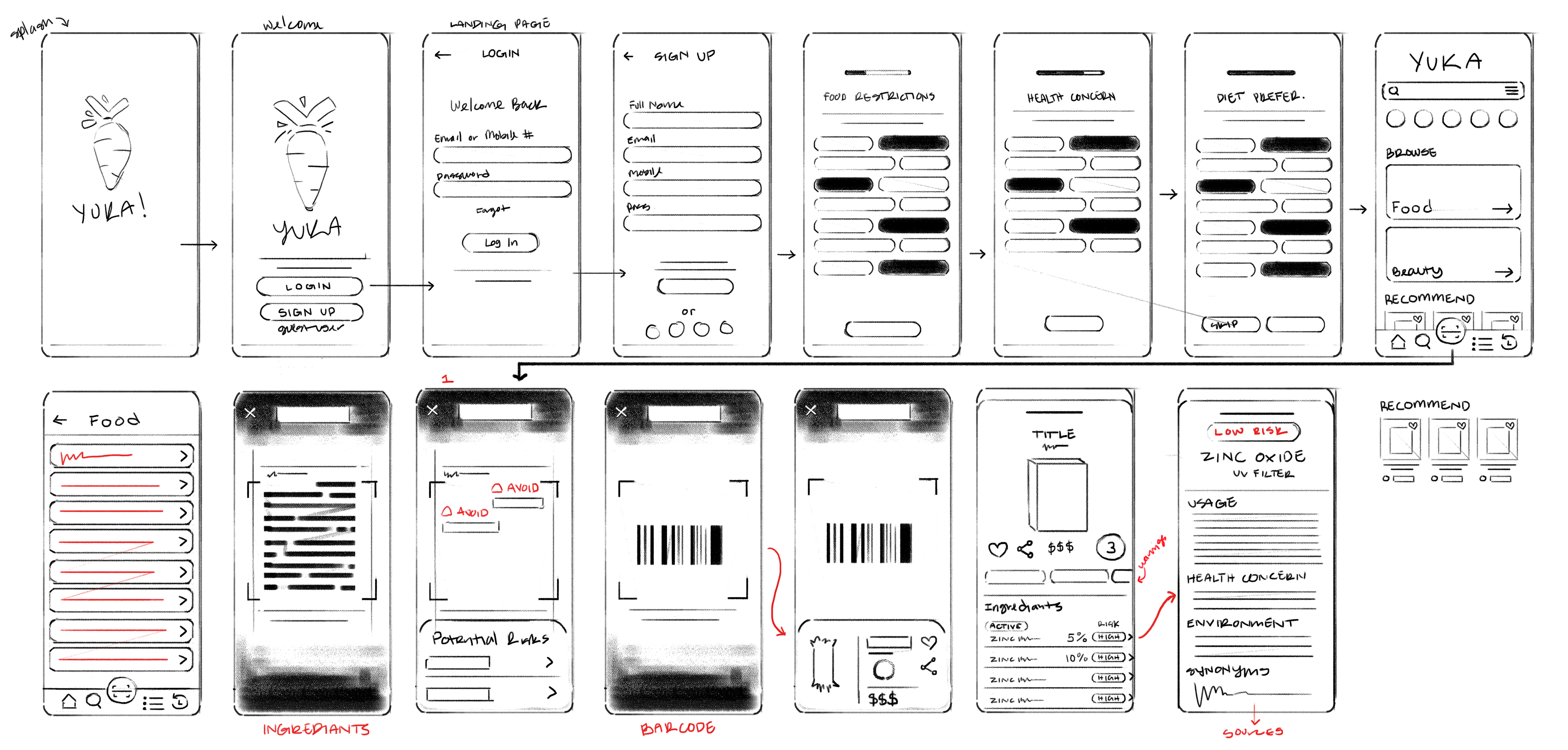
Initial Wireframe Sketches
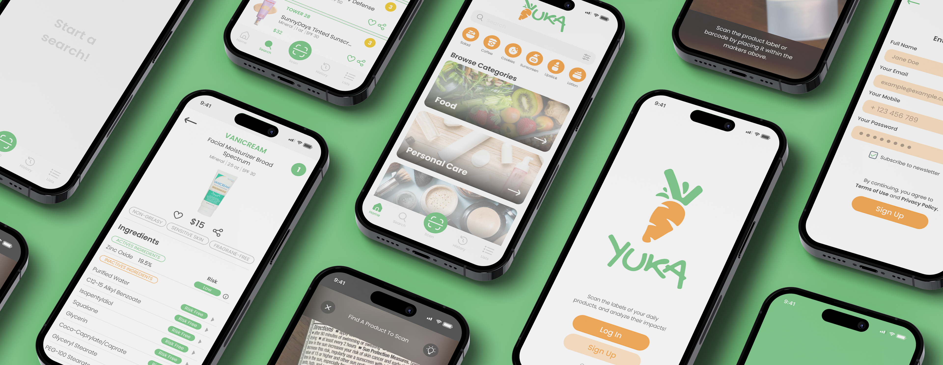
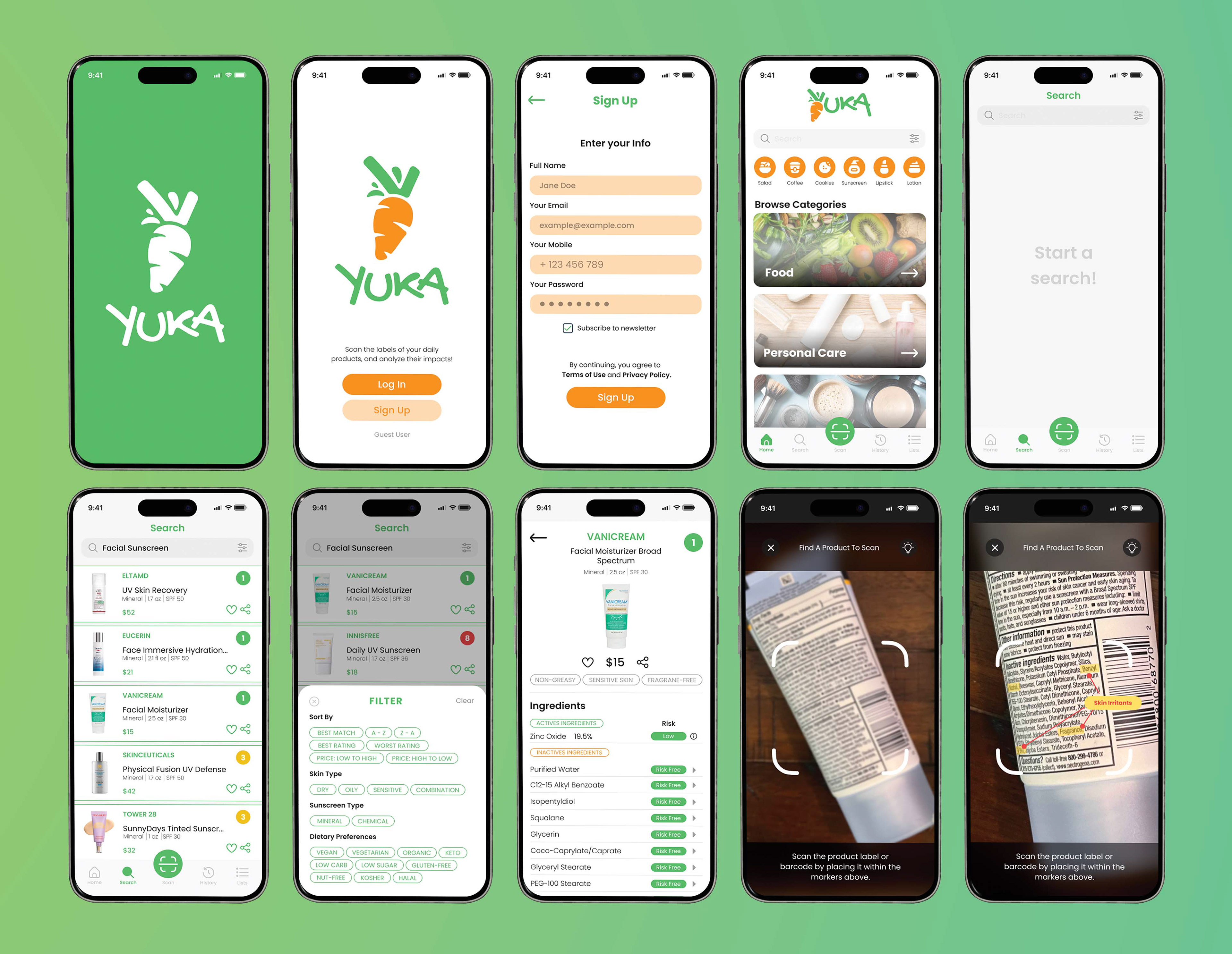
Logo Redesign
Current
Redesign

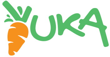
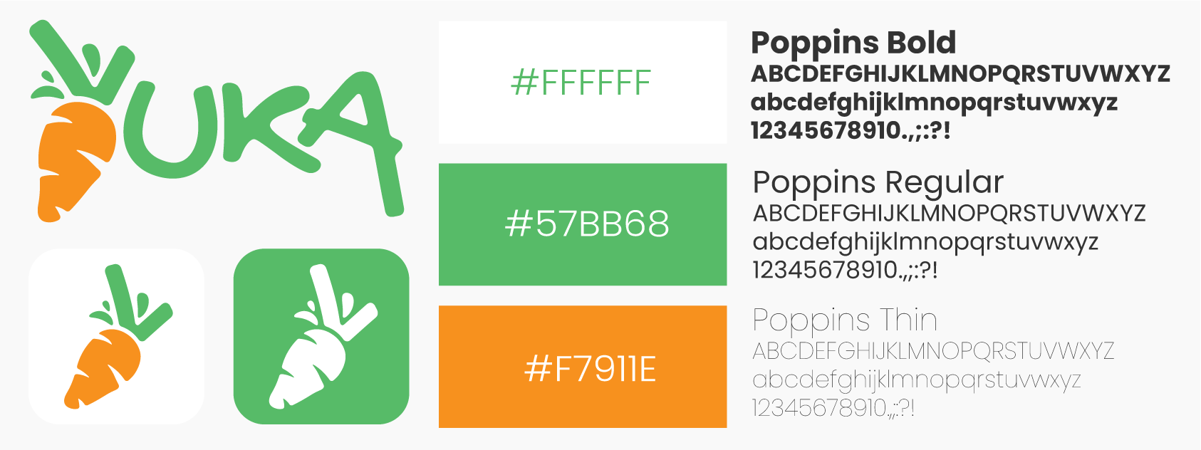
Yuka App’s current branding is a simple, modern style with a limited color palette: green, orange, and white. A carrot is an ideal symbol, as it offers a plethora of health benefits for vision, heart health, and digestion. I kept the original colors because orange often represents energy and enthusiasm, while green signifies nature, growth, and tranquility. The font, Poppins, feels approachable without being demanding, and is kept consistent throughout the application to maintain visual clarity.
User Interface Design
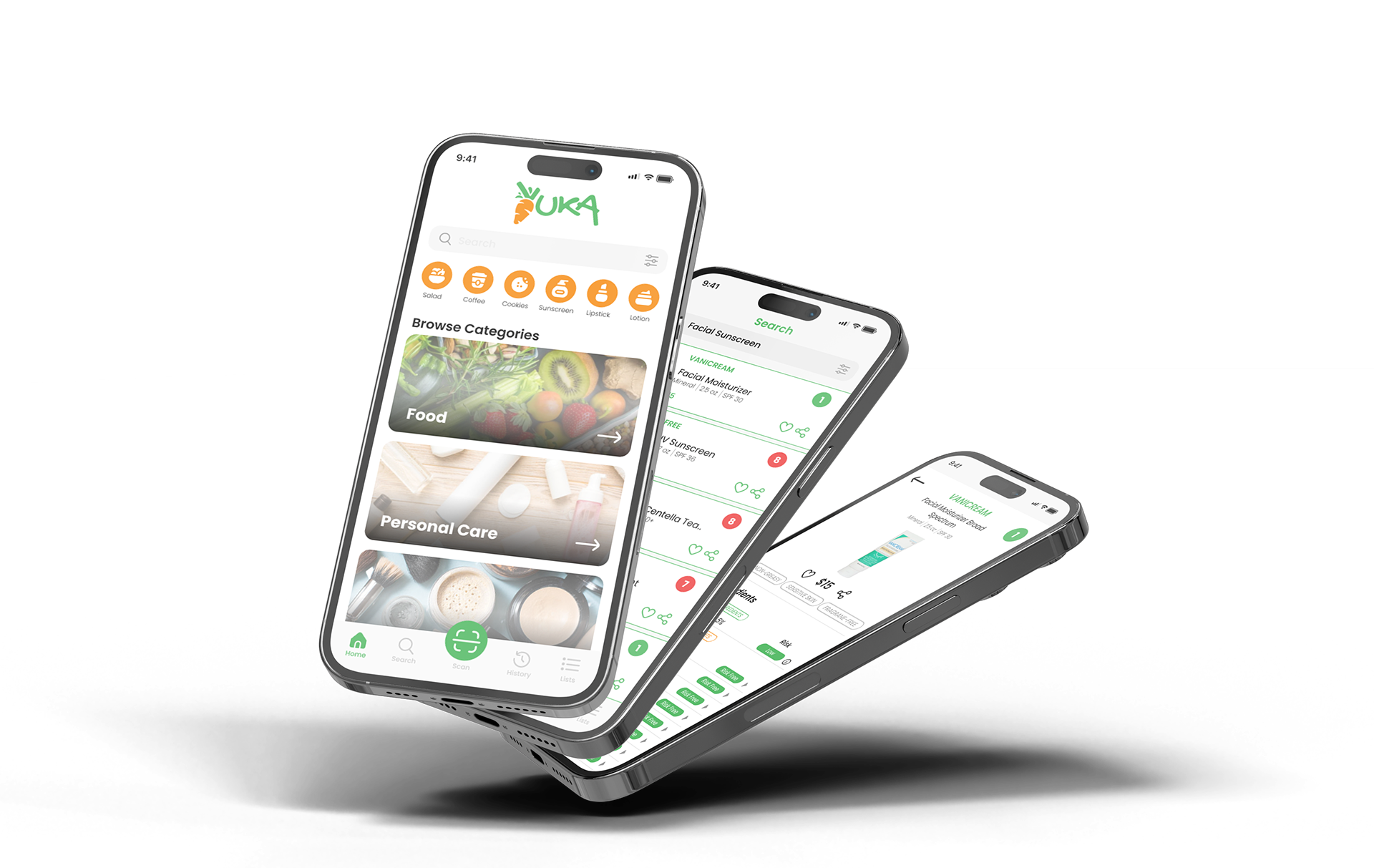
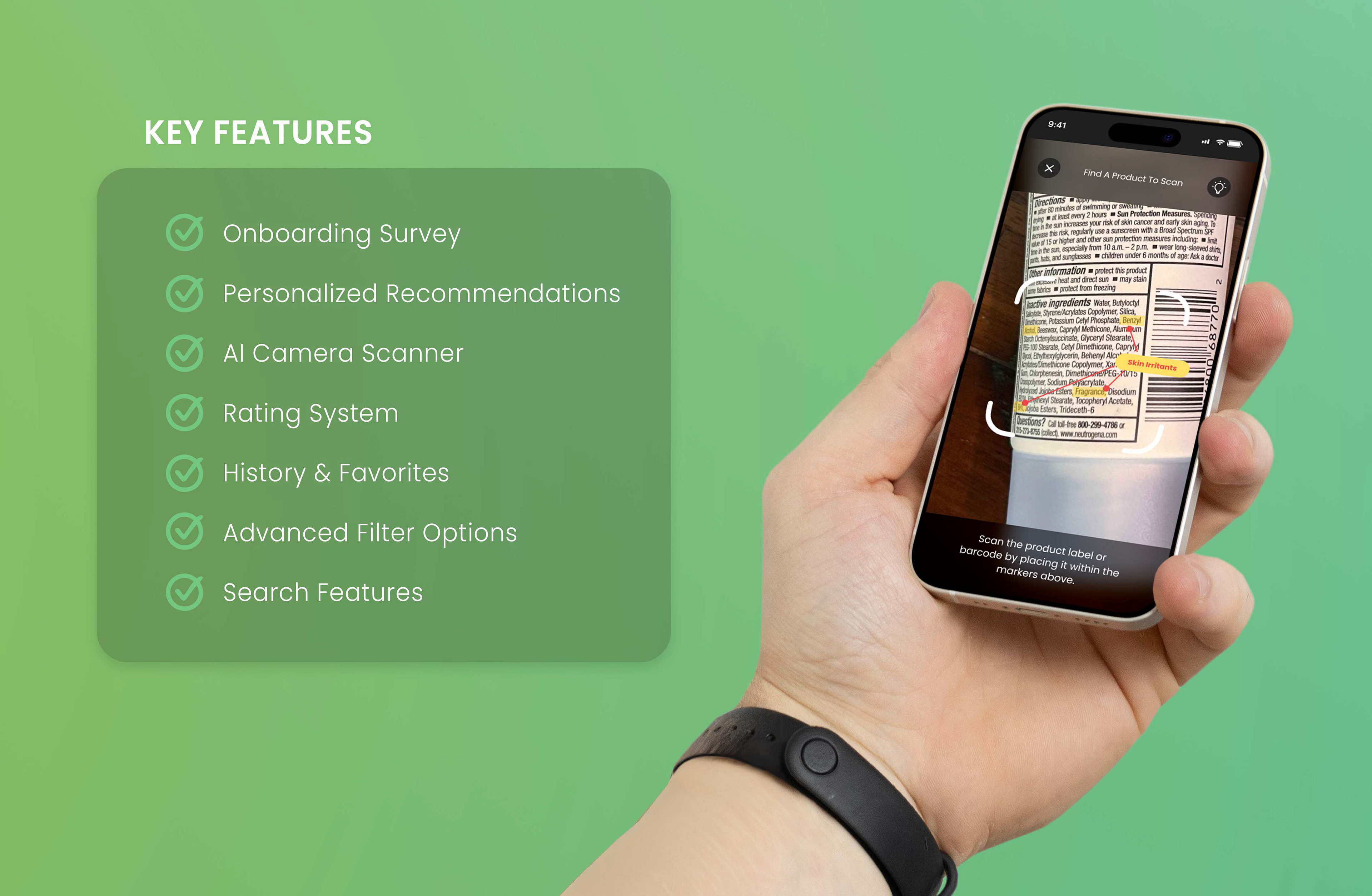
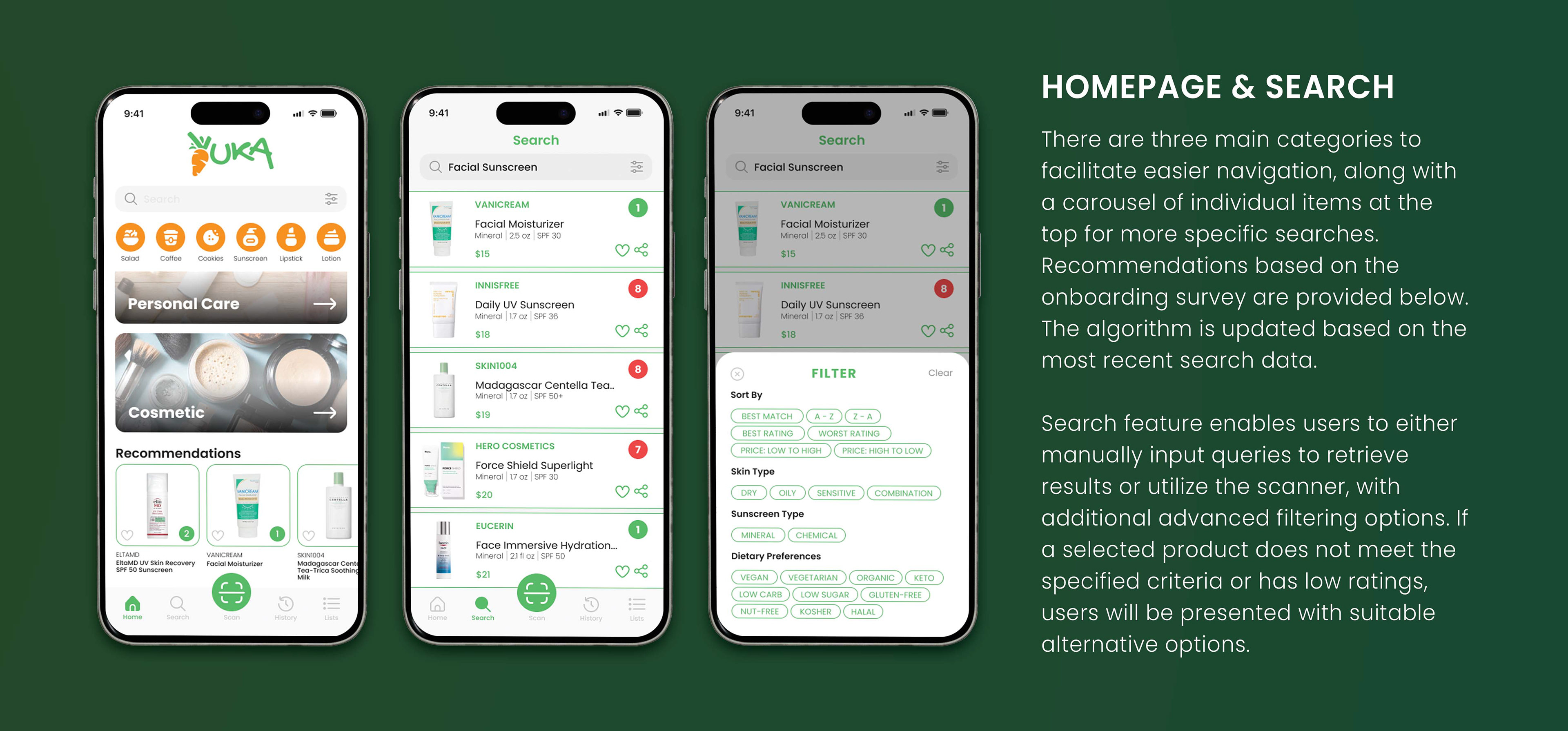
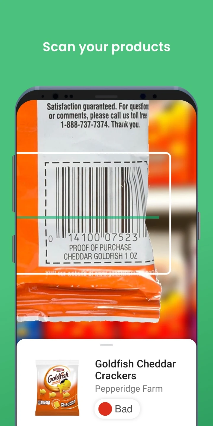
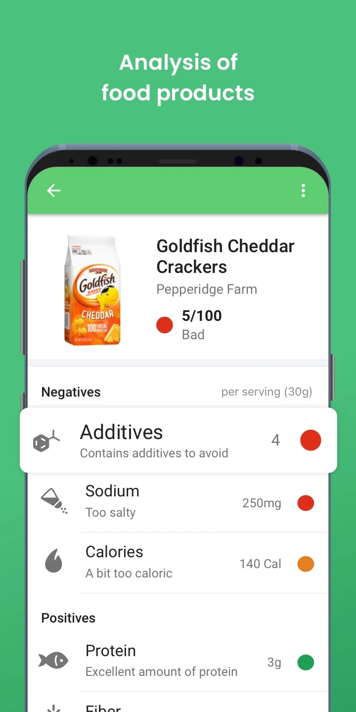
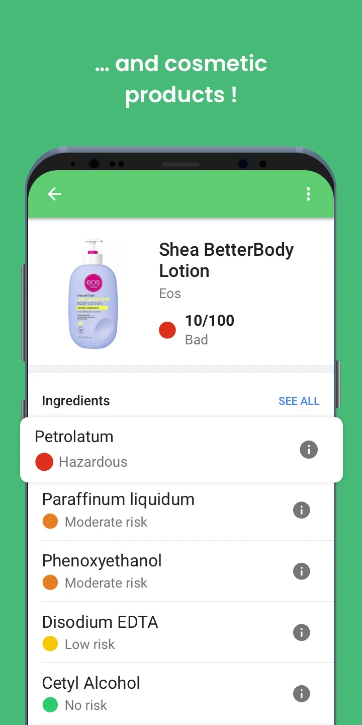
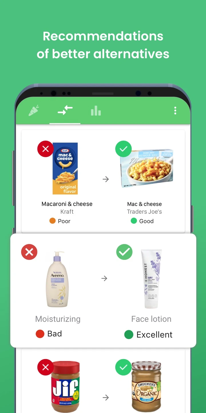
AI Camera Scanner
In addition to serving as a search tool, the scanner can be used to identify potential ingredients or chemicals for users. For example, individuals with sensitive skin can use it to avoid substances that may cause skin irritation.
Conclusion
During usability testing, the majority of participants completed tasks efficiently with minimal assistance, demonstrating an intuitive interface. Post-test feedback was predominantly positive, with most users rating the application as user-friendly and well-organized. Additionally, the majority expressed willingness to use the application regularly.